Virtual Interfaces for the BHP Track Machine Simulator
Overview
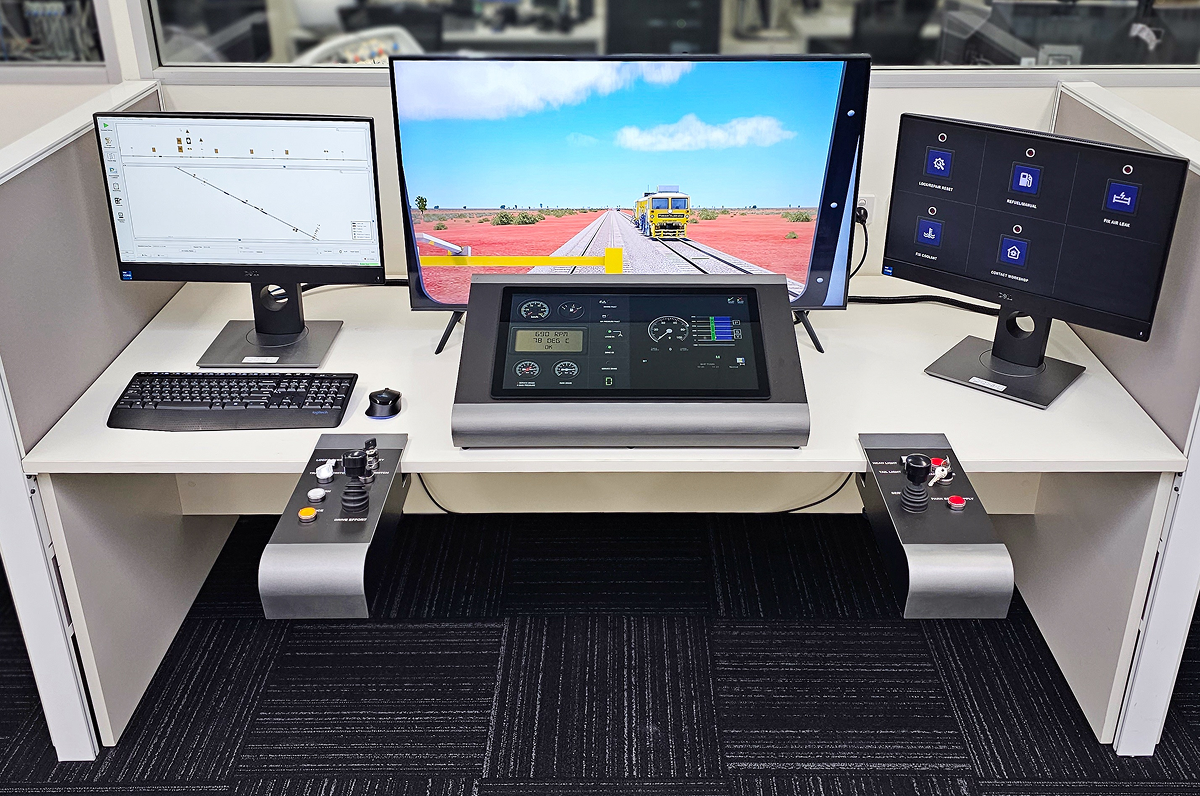
This project involved designing digital interfaces for BHP’s Track Machine Simulator, a tool used to train operators on how to manage faults and operate vehicles safely. The goal was to create interfaces that felt realistic, were easy to use, and could scale over time as the simulator evolved.
The Problem
Operators needed a way to:
- Monitor key data like speed, pressure, and fuel at a glance
- Respond quickly to faults and warnings
- Use the Virtual Vehicle Interface (VVI) for manual interventions
The challenge was to build something that felt like the real thing while keeping it intuitive enough for trainees to learn and use effectively, even when something went wrong.
Research & Insights
To better understand what operators actually needed, I spoke directly with experienced drivers and trainers. A few things stood out:
- They were more comfortable reading analog gauges a than digital numbers for things like speed and pressure.
- Faults needed to be clearly prioritised, ideally with color-coded alerts.
- he VVI touch controls had to be big, clear, and easy to tap, especially during stressful situations.
These insights guided the direction of the interface, from layout to interaction design.
Design Solutions
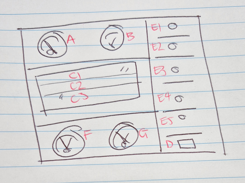
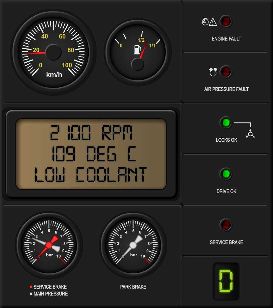
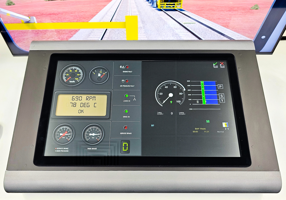
Driver Display — The Main Dashboard
Layout Breakdown:
- Left Panel: Analog-style gauges for speed, fuel, and pressure
- Center: Digital screen showing RPM, temperature, and live fault messages
- Right Panel: LED fault indicators, red for problems, green for normal status
- Bottom Section: Braking and gear display
Why it worked:
- Clean and focused: Critical info was always front and center
- Familiar format: Mimicked real-world dashboards to help trainees get comfortable faster
- Immediate alerts: Users could spot serious issues right away thanks to simple color cues
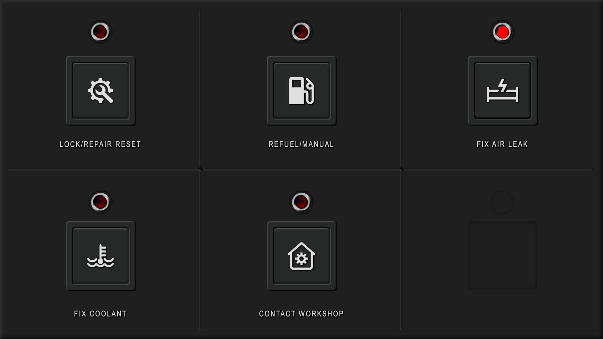
Virtual Vehicle Interface — Managing Faults
Layout Breakdown:
- Large, icon-based buttons (e.g. Refuel, Fix Coolant, etc.)
- Red status lights to flag any unresolved faults

Design Choices:
- Clear workflow: The interface walked users through what needed to be fixed and in what order
- Touch-friendly: Everything was designed to be tapped quickly, even under pressure
Results & Takeaways
- Trainees were able to respond to faults faster and more confidently
- The interface was well-received by trainers and BHP stakeholders
- The design was built to be modular and scalable, so new fault types or tools could be added down the line
All thoughts and opinions in this case study are my own and do not reflect the views of the client. Confidential details and in-depth processes have been intentionally omitted.